![]()
Anomaly, changepoint, and segment detection with sktime and skchange#
[ ]:
import datetime
import pathlib

import matplotlib.pyplot as plt
import pandas as pd
Overview of the Detection Module (“annotation”)#
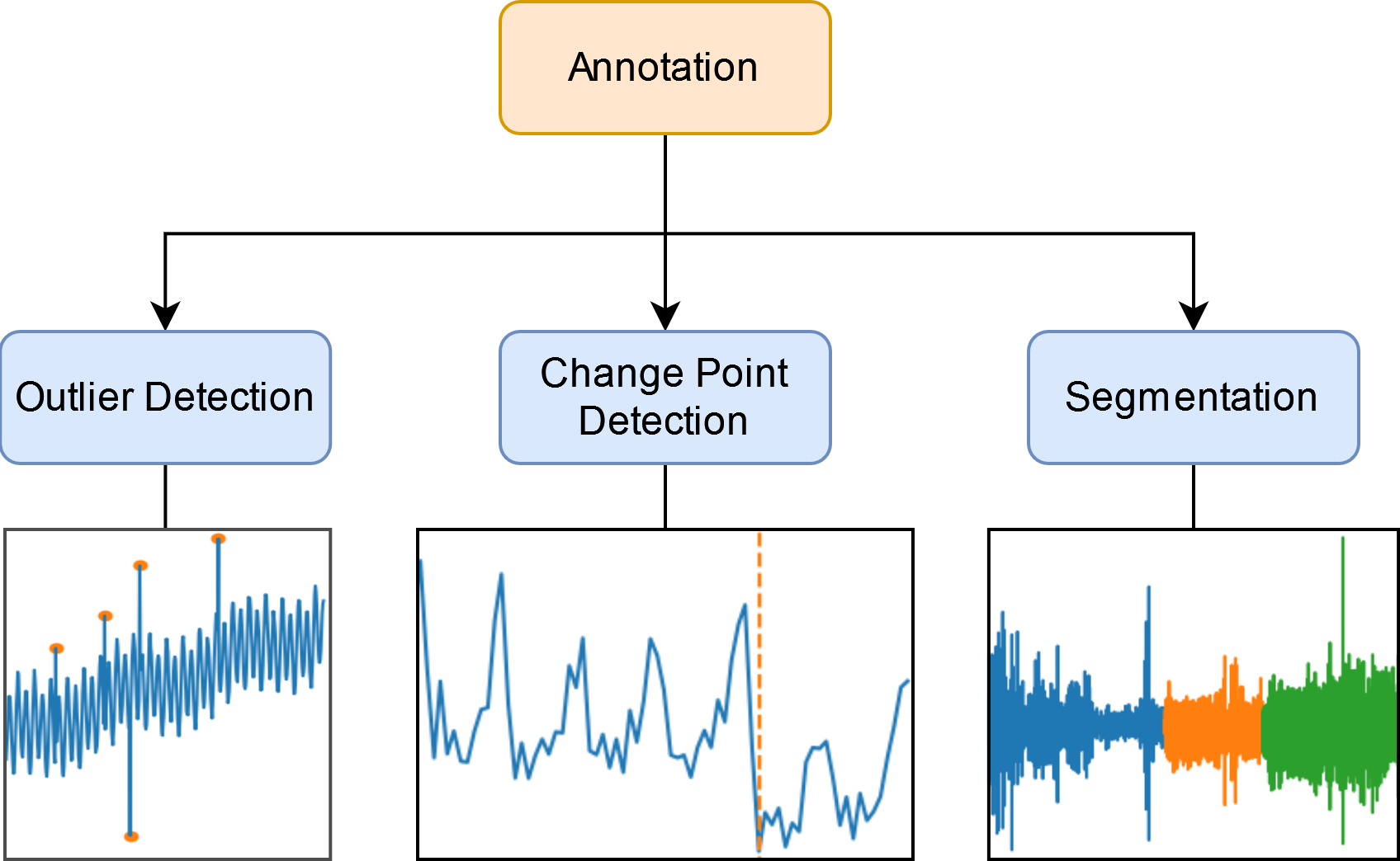
Outlier Detection
Removing unrealistic data points.
Finding points or areas of interest.
Change Point Detection
Detecting detecting signifant changes in how your data is generated.
Segmentation
Finding sequences of anomalous points.
Finding common patterns or motifs in your dataset.
Types of Outliers#
Point outliers: Individual data point that are unusual compared to the whole timeseries (global) or neighbouring points (local).
Subsequence outliers: Sequence of inidividual points that are unusual when compared to others.
Finding anomalous timeseries.
Detecting Point Outliers#
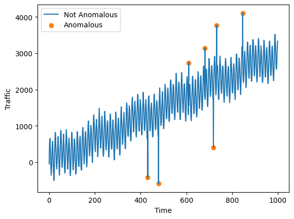
A data point is a point outlier if it is extremely high or extremely low compared to the rest of the timeseries. We will train a model to detect point outliers on the Yahoo dataset.
The Yahoo timeseries contains synthetic labelled anomalies. In reality, outlier detection is usually an unsupervised learning task so the labels are not usually provided.
[2]:
data_root = pathlib.Path("../sktime/datasets/data/")
df = pd.read_csv(data_root / "yahoo/yahoo.csv")
df.head()
[2]:
| data | label | |
|---|---|---|
| 0 | -46.394356 | 0 |
| 1 | 311.346234 | 0 |
| 2 | 543.279051 | 0 |
| 3 | 603.441983 | 0 |
| 4 | 652.807243 | 0 |
Plot the timeseries.
[3]:
fig, ax = plt.subplots()
ax.plot(df["data"], label="Not Anomalous")

mask = df["label"] == 1.0
ax.scatter(
    df.loc[mask].index, df.loc[mask, "data"], label="Anomalous", color="tab:orange"
)

ax.legend()
ax.set_ylabel("Traffic")
ax.set_xlabel("Time")
fig.savefig("outlier_example.png")
Sktime provides several agorithms for anomaly detection. STRAY is one such algorithm.
[4]:
from sktime.annotation.stray import STRAY

model = STRAY()
model.fit(df["data"])
y_hat = model.transform(df["data"])  # True if anomalous, false otherwise
y_hat
[4]:
0      False
1      False
2      False
3      False
4      False
       ...
995    False
996    False
997    False
998    False
999    False
Name: data, Length: 1000, dtype: bool
Use sum to find the number of anomalies that have been detected.
[5]:
y_hat.sum()
[5]:
3
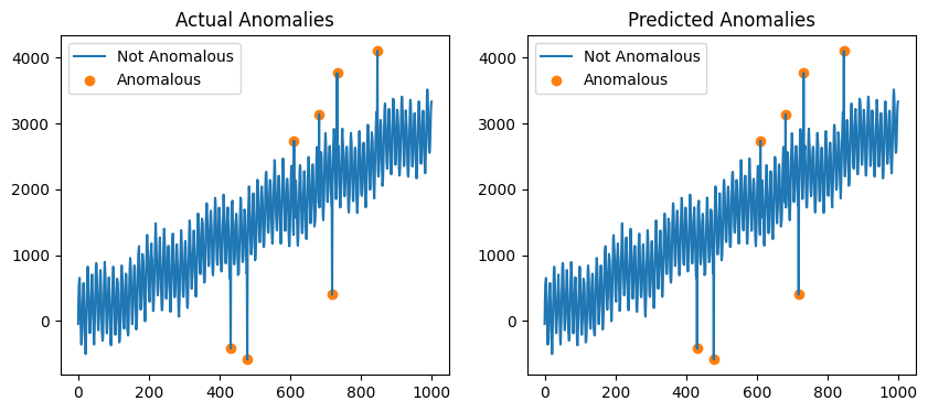
Plot the predicted anomalies.
[6]:
fig, ax = plt.subplots(1, 2, figsize=(10, 4))

# Plot the actual anomalies in the first figure
mask = df["label"] == 1.0
ax[0].plot(df["data"], label="Not Anomalous")
ax[0].scatter(
    df.loc[mask].index,
    df.loc[mask, "data"],
    color="tab:orange",
    label="Anomalous",
)
ax[0].legend()
ax[0].set_title("Actual Anomalies")

# Plot the predicted anomalies in the second figure
ax[1].plot(df["data"], label="Not Anomalous")
ax[1].scatter(
    df.loc[y_hat].index,
    df.loc[y_hat, "data"],
    color="tab:orange",
    label="Anomalous",
)
ax[1].legend()
ax[1].set_title("Predicted Anomalies")
[6]:
Text(0.5, 1.0, 'Predicted Anomalies')
STRAY is a modified version of the KNN algorithm. It cannot handle the trend in the timeseries so only the maximum and minimum values are flagged as anomalous.
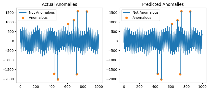
Sktime provides methods for removing trend that can be used with STRAY.
[7]:
from sktime.transformations.series.detrend import Detrender

X_detrended = Detrender().fit_transform(df["data"])

model = STRAY()
model.fit(X_detrended)
y_hat = model.transform(X_detrended)

fig, ax = plt.subplots(1, 2, figsize=(10, 4))
ax[1].plot(X_detrended, label="Not Anomalous")
ax[1].scatter(
    X_detrended.loc[y_hat].index,
    X_detrended.loc[y_hat],
    color="tab:orange",
    label="Anomalous",
)
ax[1].legend()
ax[1].set_title("Predicted Anomalies")

ax[0].plot(X_detrended, label="Not Anomalous")
ax[0].scatter(
    X_detrended.loc[df["label"] == 1.0].index,
    X_detrended.loc[df["label"] == 1.0],
    color="tab:orange",
    label="Anomalous",
)
ax[0].legend()
ax[0].set_title("Actual Anomalies")
[7]:
Text(0.5, 1.0, 'Actual Anomalies')
There is an even easier way to do this using the * operator.
[8]:
pipeline = Detrender() * STRAY()
pipeline.fit(df["data"])
y_hat = pipeline.transform(df["data"])

fig, ax = plt.subplots(1, 2, figsize=(10, 4))
ax[1].plot(df["data"], label="Not Anomalous")
ax[1].scatter(
    df.loc[y_hat, "data"].index,
    df.loc[y_hat, "data"],
    color="tab:orange",
    label="Anomalous",
)
ax[1].legend()
ax[1].set_title("Predicted Anomalies")

ax[0].plot(df["data"], label="Not Anomalous")
ax[0].scatter(
    df.loc[df["label"] == 1.0, "data"].index,
    df.loc[df["label"] == 1.0, "data"],
    color="tab:orange",
    label="Anomalous",
)
ax[0].legend()
ax[0].set_title("Actual Anomalies")
[8]:
Text(0.5, 1.0, 'Actual Anomalies')
Detecting Subsequence Outliers#
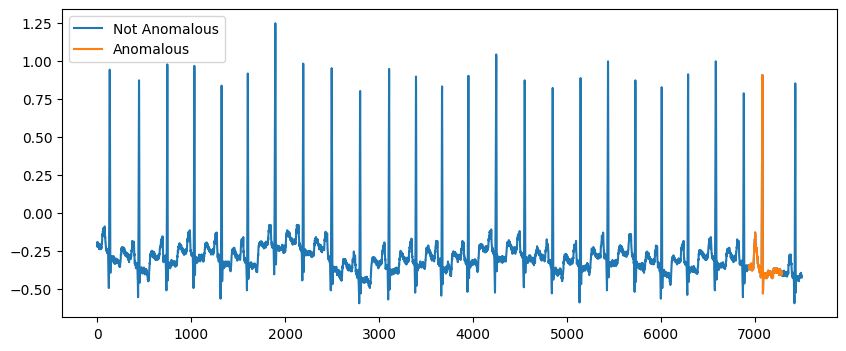
Subsequence outliers are groups of consecutive points whose behaviour is unusual. The mitdb.csv dataset is an ECG dataset and has an example of a subsequence outlier.
[9]:
path = pathlib.Path(data_root / "mitdb/mitdb.csv")
df = pd.read_csv(path)
df.head()
[9]:
| data | label | |
|---|---|---|
| 0 | -0.195 | 0 |
| 1 | -0.210 | 0 |
| 2 | -0.210 | 0 |
| 3 | -0.225 | 0 |
| 4 | -0.220 | 0 |
Plot the timeseries.
[10]:
fig, ax = plt.subplots(1, 1, figsize=(10, 4))
ax.plot(df["data"], label="Not Anomalous")
ax.plot(df.loc[df["label"] == 1.0, "data"], label="Anomalous")
ax.legend()
[10]:
<matplotlib.legend.Legend at 0x7fe0e4f81c30>
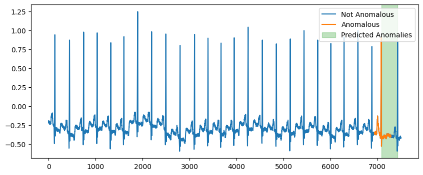
We can use Capa from Skchange to predict the anomalous subsequence. NorskRegnesentral/skchange.
Skchange is a package that is 2nd party supported by Sktime.
[11]:
from skchange.anomaly_detectors.capa import Capa

model = Capa(max_segment_length=350)
model.fit(df["data"])
anomaly_intervals = model.predict(df["data"])
anomaly_intervals
[11]:
0    [7084, 7425]
Name: anomaly_interval, dtype: interval
[12]:
print("left: ", anomaly_intervals.iat[0].left)
print("right: ", anomaly_intervals.iat[0].right)
left:  7084
right:  7425
Capa returns the anomalous subsequences as a series of intervals.
Plot the anomalous subsequence.
[13]:
fig, ax = plt.subplots(figsize=(10, 4))
ax.plot(df["data"], label="Not Anomalous")
ax.plot(df.loc[df["label"] == 1.0, "data"], label="Anomalous")

for interval in anomaly_intervals:
    left = interval.left
    right = interval.right
    ax.axvspan(left, right, color="tab:green", alpha=0.3, label="Predicted Anomalies")

ax.legend()
[13]:
<matplotlib.legend.Legend at 0x7fe0e4cfeb60>
Change Point Detection#
Change point detection is used to find points in a timeseries where the underlying mechanism generating the data changes.
The seatbelt dataset shows a change in the number of people who were killed or seariously injured on the road when wearing a seatbelt was made mandatory.
[14]:
df = pd.read_csv(data_root / "seatbelts/seatbelts.csv", index_col=0, parse_dates=True)
df.head()
[14]:
| KSI | label | |
|---|---|---|
| 1969-01-01 | 1687 | 0 |
| 1969-02-01 | 1508 | 0 |
| 1969-03-01 | 1507 | 0 |
| 1969-04-01 | 1385 | 0 |
| 1969-05-01 | 1632 | 0 |
Plot the seatbelt dataset.
[15]:
fig, ax = plt.subplots(1, 1, figsize=(10, 3))
ax.plot(df["KSI"])

actual_cp = datetime.datetime(1983, 2, 1)
ax.axvline(
    actual_cp,
    color="tab:orange",
    linestyle="--",
    label="Wearing Seatbelts made Compulsory",
)
ax.legend()
ax.set_xlabel("Time")
ax.set_ylabel("KSI")
fig.savefig("seatbelt_example.png")
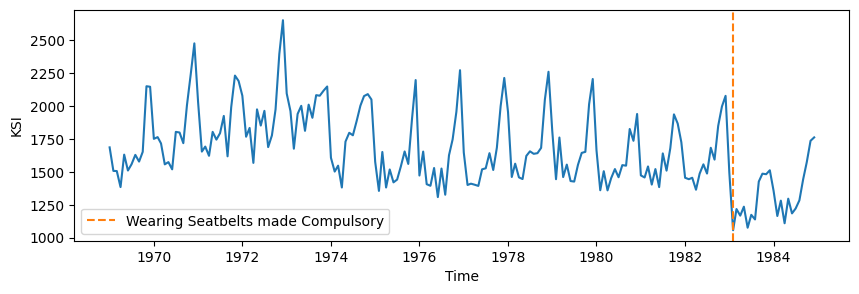
It was made compulsory to wear a seatbelt in the UK on January 31st 1983.
It was made mandatory to install seatbelts in all new cars in 1968.
Use binary segmentation to find change points where there is a drop in 1000 KSI.
[16]:
from sktime.annotation.bs import BinarySegmentation

model = BinarySegmentation(threshold=1000)
predicted_change_points = model.fit_predict(df)
print(predicted_change_points)
0   1974-12-01
1   1983-01-01
dtype: datetime64[ns]
For change point detectors, predict returns a series containing the indexes of the change points.
[17]:
fig, ax = plt.subplots(figsize=(10, 4))
ax.plot(df["KSI"])
ax.axvline(
    actual_cp,
    label="Wearing Seatbelts Made Compulsory",
    color="tab:orange",
    linestyle="--",
)

for i, cp in enumerate(predicted_change_points):
    label = "Predicted Change Points" if i == 0 else None
    ax.axvline(cp, color="tab:green", linestyle="--", label=label)

ax.set_ylabel("KSI")
ax.set_xlabel("Date")
ax.legend()
[17]:
<matplotlib.legend.Legend at 0x7fe0cf024be0>

The actual change point was identified almost exactly.
Further Reading#
A Review on Outlier/Anomaly Detection in Time Series Data https://arxiv.org/pdf/2002.04236
A review of change point detection algorithms https://arxiv.org/abs/2003.06222
A discussion on the limitations of metrics for timeseries anomaly detection https://arxiv.org/pdf/2009.13807.
Data Sources#
Credits: notebook - anomaly, changepoint detection#
notebook creation: alex-jg3 (notebook adapted from alex-jg3 notebook at ODSC 2024)
detection module design: fkiraly, miraep8, alex-jg3, lovkush-a, aiwalter, duydl, katiebuc, tveten
skchange: tveten, Norsk Regnesentral
Generated using nbsphinx. The Jupyter notebook can be found here.